Introduction: How to Design a Logo That Makes Your Brand Stand Out
A logo is one of the most important visual elements of a brand. It helps people recognize a business, remember its identity, and distinguish it from competitors. Whether you are launching a startup, building a personal brand, opening an online store, or refreshing an established business, a thoughtfully designed logo can help communicate your brand’s personality and values.
Learning how to design a logo involves much more than choosing an attractive icon or combining a few colors. A successful logo requires research, strategic thinking, creativity, typography, color selection, and careful refinement.
Think about the brands you recognize immediately. Some use simple symbols, others rely on distinctive lettering, and some combine text with memorable graphic elements. Their logos work because they are designed to represent a specific identity while remaining recognizable across different platforms.
A professional logo should be easy to identify, visually balanced, appropriate for its audience, and adaptable to different applications. It should work on a website, social media profile, business card, product package, storefront, and other marketing materials.
The good news is that you do not need to be an expert graphic designer to understand the logo design process. By following a structured approach, you can develop stronger ideas, avoid common mistakes, and create a visual identity that supports your business goals.
In this comprehensive guide on how to design a logo, you will learn how to research your brand, choose the right logo style, select colors and fonts, create original concepts, use design tools, refine your design, and prepare your final logo files.
Whether you are a beginner, entrepreneur, freelancer, or aspiring designer, these practical steps will help you approach logo creation with greater confidence.
1. Understand What a Logo Really Does
Before learning how to design a logo, it is important to understand its purpose.
A logo is a visual identifier that represents a business, organization, product, or individual. It can include text, symbols, shapes, or a combination of these elements.
However, a logo is not the entire brand identity. Brand identity also includes typography systems, colors, imagery, communication style, packaging, and other visual or verbal elements.
A logo is one part of that broader system.
Why is a logo important?
Brand recognition: A distinctive logo helps customers identify your business across different platforms.
Professional appearance: A carefully designed logo can make a business appear organized and credible.
Differentiation: An original visual identity helps distinguish your business from competitors.
Consistency: A logo provides a recognizable element that can appear across websites, advertisements, packaging, and printed materials.
Memorability: A simple and relevant logo may be easier for people to remember than a complicated design.
What makes a logo effective?
An effective logo generally has five characteristics:
-
Simplicity: It communicates its identity without unnecessary visual clutter.
-
Relevance: Its style fits the brand’s industry, audience, and personality.
-
Memorability: Its visual features are distinctive enough to be recognized.
-
Versatility: It works across different sizes, backgrounds, and media.
-
Longevity: It avoids relying entirely on short-lived visual trends.
These principles provide a useful foundation for anyone learning how to design a logo professionally.
2. Start With Brand Research Before Designing
One of the most common logo design mistakes is opening a design application immediately and experimenting with random shapes, fonts, and colors.
A better approach is to understand the brand before creating visual concepts.
Research helps you identify what the logo should communicate and what will make it appropriate for its intended audience.
Define your brand’s purpose
Begin by answering a few fundamental questions:
-
What does the business offer?
-
What problem does it solve?
-
Who are its customers?
-
What makes it different from competitors?
-
What three words should describe its personality?
-
Where will the logo appear most frequently?
For example, a premium skincare brand might want to communicate elegance, purity, and confidence. A children’s learning platform might prioritize friendliness, creativity, and accessibility.
These two brands would likely require different visual approaches.
Understand your target audience
A logo should be designed for the people who need to recognize and connect with the brand.
Consider your audience’s age range, preferences, expectations, and familiarity with the product category.
A technology company serving enterprise customers may benefit from a restrained, highly legible identity. A creative studio may have more freedom to experiment with expressive lettering and unusual shapes.
These are strategic starting points rather than universal rules. Your research should guide your choices instead of relying on stereotypes.
Write a simple brand brief
A brand brief is a short document that summarizes the direction of the project.
It might include:
-
Brand name and business category.
-
Target audience.
-
Brand mission and values.
-
Competitor references.
-
Preferred visual personality.
-
Main logo applications.
-
Practical restrictions, such as color or printing requirements.
A clear brief prevents unnecessary experimentation and makes it easier to evaluate your concepts objectively.
3. Research Competitors Without Copying Them
Competitor research is an essential part of learning how to design a logo that stands out.
Study businesses operating in the same industry and observe their visual identities. Look at their websites, packaging, advertisements, social media profiles, and physical products.
The purpose is not to reproduce their designs. It is to understand the visual conventions in your category and identify opportunities for differentiation.
What should you look for?
Pay attention to:
-
Common colors used in the industry.
-
Typography styles.
-
Symbols and illustrations.
-
Geometric versus organic shapes.
-
Minimalist versus detailed compositions.
-
Use of wordmarks, monograms, or combination marks.
For example, if most competitors use similar blue symbols and geometric sans-serif fonts, you might explore another direction that still feels appropriate for the industry.
You could differentiate the brand through a distinctive wordmark, a more expressive color palette, or an original symbol.
Create a visual inspiration board
Collect examples of typography, shapes, color combinations, packaging, and visual styles that relate to your brand brief.
Organize the references by theme, such as modern, playful, natural, luxurious, or technical.
An inspiration board helps clarify your design direction before you begin sketching.
However, inspiration should not become imitation. Avoid tracing another company’s logo or creating a design that could be confused with an existing brand.
Originality matters for both brand recognition and potential trademark protection.
4. Choose the Right Type of Logo
One of the most important decisions in logo design is selecting the right logo category.
Different logo styles solve different branding problems. Some emphasize the brand name, while others use symbols or combine text and graphics.

1. Wordmark logo
A wordmark uses the brand name as the primary visual element, often with custom or carefully selected typography.
It is suitable for brands with distinctive names that want to build recognition around their lettering.
Examples: Google and Coca-Cola.

2. Symbol or pictorial logo
A symbol-based logo uses an image or graphic mark as its main identifier.
It can work well when the symbol is distinctive and supported by sufficient brand recognition.
Example: Apple’s recognizable apple symbol.

3. Monogram logo
A monogram uses initials or abbreviated lettering to create a compact visual identity.
It is useful for businesses with long names, personal brands, and organizations that want a concise mark.

4. Combination logo
A combination mark brings together text and a symbol.
It is a flexible choice for new businesses because the name and graphic can reinforce each other while the brand develops recognition.

5. Emblem logo
An emblem places text inside or around a contained shape, such as a badge, crest, or seal.
It can suit educational institutions, clubs, traditional businesses, and selected food or hospitality brands.
Which logo style should you choose?
Choose a wordmark if the brand name is distinctive and readability is a priority. Consider a monogram if the full name is long. A combination mark can be useful when you want a symbol and brand name to work together.
The best option depends on your brand strategy, name, audience, and intended applications.
You do not need to choose the most elaborate style. A simple, well-executed wordmark can be more effective than a complicated illustration.
5. Develop a Strong Logo Concept
A logo concept is the central idea behind your design. It connects the visual elements to the brand’s purpose and personality.
Without a clear concept, a logo can become a collection of decorative elements that look attractive but communicate little.
also read: How to Create a Mascot Logo: A Complete Guide to Building a Memorable Brand Identity
Begin with keywords
Review your brand brief and select three to five words that describe the desired identity.
For example:
-
Premium.
-
Modern.
-
Trustworthy.
-
Innovative.
-
Minimal.
For a different brand, your keywords might be playful, energetic, friendly, and approachable.
These words help determine the shapes, typography, and colors you explore.
Use visual metaphors
A visual metaphor represents an idea through a recognizable form.
A business focused on growth might explore upward movement, branching forms, or expanding geometry. A travel brand might use a path, horizon, or abstract sense of movement.
The metaphor does not need to be literal. In fact, abstract interpretations can make a logo more distinctive.
Avoid overly obvious concepts
A fitness brand does not always need a dumbbell. A bakery does not always need a cupcake. A technology business does not always need a circuit-board symbol.
Literal imagery can work, but it is not the only option.
Try to find a visual idea that communicates something specific about the brand rather than simply representing its industry.
Write a one-sentence concept statement
Before sketching, describe your idea in one sentence.
For example:
“The logo combines a rising geometric form with clean typography to communicate progress, clarity, and professional confidence.”
This statement gives you a standard against which to evaluate your designs.
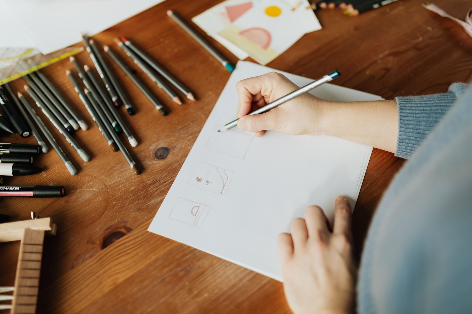
6. Sketch Multiple Logo Ideas Before Using Software
Sketching is one of the simplest ways to explore ideas quickly.
You do not need advanced drawing skills. The purpose is to experiment with composition, letterforms, shapes, and symbols before investing time in polished digital designs.
Why sketching helps
Drawing on paper encourages experimentation without the distractions of software controls.
You can explore several alternatives, combine ideas, and reject weak concepts quickly.
A small sketchbook or plain sheet of paper is enough.
How to sketch logo concepts
Follow this process:
-
Write the brand name at the top of the page.
-
Note your brand keywords beside it.
-
Sketch different typography treatments.
-
Explore symbols or monograms where appropriate.
-
Experiment with horizontal, vertical, and compact layouts.
-
Create several variations rather than refining the first idea immediately.
-
Circle the strongest concepts for further development.
Aim for a range of genuinely different directions instead of producing dozens of nearly identical versions.
For example, one concept might be a wordmark, another a monogram, and a third a combination mark.
Think in simple shapes
Start with circles, squares, triangles, lines, and basic geometric forms.
Many effective logos use simple shapes because they are easier to recognize, reproduce, and scale.
However, simplicity alone does not guarantee quality. The shape should still be distinctive and appropriate for the brand.
7. Select the Right Typography for Your Logo
Typography can dramatically change how a logo feels.
A font may communicate elegance, friendliness, technical precision, tradition, or playfulness even before someone reads the brand name.
When learning how to design a logo, pay close attention to letterforms, spacing, proportions, and readability.
Serif fonts
Serif typefaces have small finishing strokes at the ends of many letterforms.
They can communicate tradition, sophistication, editorial character, or established credibility, depending on the specific design.
Serif typography may suit premium products, publishing brands, professional services, and businesses that want a more classic identity.
Sans-serif fonts
Sans-serif typefaces generally lack those finishing strokes.
They often work well for contemporary, digital, and minimalist identities because many have clean, adaptable letterforms.
However, sans-serif fonts can communicate many different personalities depending on their proportions and weight.
Script fonts
Script typefaces imitate handwriting or calligraphy.
They can communicate elegance, personality, or a handcrafted quality. They may suit selected beauty, hospitality, creative, or lifestyle brands.
Be careful with overly decorative scripts because they can become difficult to read at small sizes.
Display fonts
Display typefaces are designed to attract attention and may have distinctive shapes or unusual proportions.
They can help create an expressive logo, especially when the brand needs a strong visual personality.
Their suitability depends on readability, originality, and how well they reflect the business.
Should you use multiple fonts?
A logo usually benefits from a focused typographic approach.
Combining too many typefaces can make the design feel inconsistent. If your logo includes a tagline, choose typography that supports the main brand name instead of competing with it.
Customize the lettering carefully
Professional logo design sometimes involves adjusting letter spacing, modifying individual characters, or creating custom letterforms.
Even small changes can make a wordmark more distinctive.
If you modify a font, check the relevant font license and make sure your use is permitted.
Always test the final lettering at the actual sizes where customers will see it.
8. Choose a Color Palette That Supports Your Brand
Color influences perception and helps distinguish a logo from competing identities.
However, colors do not have fixed meanings for every person or culture. Their effects depend on context, industry conventions, surrounding colors, and audience expectations.
A thoughtful color palette should support the brand’s personality while remaining practical across different applications.
Common color associations
Blue
Often associated with reliability, calmness, and professionalism.
Green
Can suggest nature, growth, freshness, or environmental themes.
Orange
Can communicate energy, warmth, friendliness, or enthusiasm.
Purple
May suggest creativity, imagination, or luxury, depending on the context.
Black
Often supports a minimalist, formal, bold, or premium visual direction.
Red
Can convey energy, urgency, passion, or intensity.
How many colors should a logo use?
For many brands, one to three primary colors are a useful starting point.
A monochrome logo can be highly effective, particularly for businesses that want a simple and adaptable identity.
A more colorful logo may suit brands with a playful or expressive personality, provided the palette remains coherent.
Test the logo in black and white
This is an important step in professional logo design.
If the logo only works because of a particular color combination, its shape or contrast may need improvement.
Create a black version, a white version, and a full-color version where appropriate.
The logo should remain recognizable when printed in a single color or displayed on a background with limited color options.
Consider contrast and accessibility
Make sure the logo remains visible against its intended background.
Thin lettering, low contrast, and similar foreground and background colors can reduce readability.
If your logo includes small text, test it at realistic sizes rather than relying only on a large design preview.
9. Use Shapes and Negative Space Intelligently
Shapes help communicate visual ideas and influence the personality of a logo.
Circles can create a sense of continuity, while angular forms may feel more dynamic or structured. These are possible associations, not strict psychological laws.
The important question is whether the shape supports the brand concept.
Geometric shapes
Geometric forms can create clean, organized, and modern visual identities.
They are useful for abstract symbols, monograms, and logos that need consistent proportions.
Organic shapes
Organic forms have more natural, irregular, or fluid characteristics.
They may suit brands connected to food, wellness, nature, handmade products, or creative services.
Negative space
Negative space is the empty area around or within a shape.
Used carefully, it can create a secondary visual element or make a logo feel more balanced.
For example, a designer might use the gap between two shapes to suggest a path, an initial, or a simple object.
Negative space should enhance recognition rather than make the design unnecessarily difficult to understand.
Avoid unnecessary details
A logo with too many lines, decorative elements, and tiny features can lose clarity when reduced in size.
Simplify the concept until the most important visual idea becomes easy to recognize.
10. Choose the Right Logo Design Software
You can design a logo using different tools, depending on your experience, budget, and preferred workflow.
The best software is the one that lets you create a clean, editable design and export suitable files.

Adobe Illustrator
A professional vector design application suited to custom lettering, precise shapes, scalable artwork, and detailed logo construction.
Best for: Professional vector logo design and advanced customization.

Inkscape
A free, open-source vector graphics editor that supports many core logo design tasks.
Best for: Beginners and designers seeking a no-cost vector workflow.

Canva
A browser-based design platform with templates, text tools, shapes, and simple layout controls.
Best for: Beginners, quick concepts, and straightforward brand graphics.

Affinity Designer
A design application for vector artwork and other graphic design tasks, useful for constructing custom marks and typography.
Best for: Designers who want flexible vector editing and detailed control.
Vector versus raster design
This distinction is particularly important.
Vector graphics are built from mathematically defined paths and shapes. They can generally be scaled to different sizes without losing sharpness.
Raster graphics are made from pixels. They can become blurry or pixelated when enlarged beyond their original resolution.
For most professional logos, a vector master file is highly valuable.
Formats such as SVG, EPS, and PDF can support vector artwork, depending on how the file is created and exported. PNG is useful for digital use, especially when a transparent background is needed.
A JPG may be useful for previews or simple placements, but it does not support transparency and is not an ideal master file.
11. Create Your First Digital Logo
Once your research and sketches are complete, you can begin building the logo digitally.
The goal is to translate your strongest concept into a clean and consistent design.
Step 1: Set up your canvas
Create a new document with enough room to work comfortably.
For a vector logo, the canvas does not need to match one specific final output size because the artwork can be exported for different applications.
Keep your work organized so you can edit the symbol, typography, and background separately where appropriate.
Step 2: Build the main structure
Start with the most important element.
For a wordmark, focus on the lettering. For a symbol-based logo, begin with the main shape. For a combination mark, establish how the symbol and text relate to one another.
Avoid adding decorative elements before the main composition works.
Step 3: Refine alignment and proportions
Check the balance between shapes, letters, and empty space.
A symbol that looks centered mathematically may not look centered visually. Optical adjustments can help create a more balanced appearance.
Review spacing between individual letters, between the symbol and wordmark, and around the outer edges of the composition.
Step 4: Apply your colors
Begin with a single-color version so you can evaluate the shape and contrast.
Then introduce the brand palette and check whether the colors support the concept.
Step 5: Remove unnecessary elements
Examine every part of the design and ask whether it contributes to recognition or communication.
Remove details that do not serve a clear purpose.
Step 6: Save an editable master
Preserve your original design in an editable format supported by your software.
This makes future refinements, alternate color versions, and different exports easier to manage.
12. Test Your Logo at Different Sizes
A logo can look impressive on a large screen but become unreadable when used as a small social media icon.
Testing at realistic sizes is therefore essential.
Small-size testing
Preview the logo at sizes similar to those used for website headers, mobile screens, profile images, and favicons.
Look for tiny details that disappear, thin lines that become unclear, and text that is too small to read.
If necessary, simplify the symbol or create a compact version for small applications.
Large-size testing
Enlarge the logo to see whether curves, spacing, and edges remain clean.
Vector artwork should scale without pixelation, but visual problems can still become more noticeable at larger sizes.
Background testing
Place the logo on light, dark, and appropriately colored backgrounds.
Check whether the design maintains sufficient contrast.
Prepare alternate versions if the logo needs to appear on different surfaces.
Real-world mockups
Preview your logo on relevant applications, such as:
-
Business cards.
-
Website headers.
-
Product packaging.
-
Social media profiles.
-
Storefront signage.
-
Presentation slides.
-
Uniforms or merchandise.
Mockups help you understand how the design may appear in context.
However, a mockup should not replace testing the actual logo file. Effects, shadows, textures, and presentation lighting can make a weak design look more impressive than it really is.
13. Make Your Logo Unique and Memorable
A logo should help people distinguish your brand from others.
Originality does not require an extremely unusual design. Often, a distinctive detail in the lettering, proportions, shape, or composition is enough to create a recognizable identity.
Avoid generic symbols
Common icons can be useful starting points, but they may not help your brand stand out.
If you use a familiar symbol, explore how you can interpret it differently through shape, negative space, composition, or custom lettering.
Develop a recognizable detail
Your logo might feature:
-
A custom letterform.
-
A distinctive proportion.
-
A meaningful visual metaphor.
-
A memorable relationship between shapes.
-
A unique combination of typography and symbol.
The feature should support the brand rather than exist only to make the design look complicated.
Check for similarity
Before finalizing a commercial logo, compare it with relevant existing brands.
Search for similar names, symbols, and visual arrangements. If the business intends to register the logo as a trademark, consider a more thorough clearance search and obtain professional advice where appropriate.
Avoid assuming that changing a color or slightly adjusting an existing logo makes it sufficiently original.
14. Get Feedback and Refine the Design
Designers can become attached to their own ideas. Feedback helps reveal problems that you might overlook.
The most useful feedback focuses on clarity, relevance, and functionality rather than personal taste alone.
Ask focused questions
Instead of asking, “Do you like this logo?” ask:
-
What kind of business do you think this represents?
-
What stands out first?
-
Is the brand name easy to read?
-
Does the logo feel appropriate for the intended audience?
-
Is any element confusing?
-
Does the design look distinct from competitors?
These questions produce more useful observations.
Show your concepts in context
Present your logo on a white background, in black and white, and at a small size.
You can also show a relevant mockup, but avoid relying on elaborate presentation effects to persuade people that the design is strong.
Refine instead of endlessly redesigning
Collect the feedback, identify recurring issues, and make targeted improvements.
You may need to adjust spacing, simplify a symbol, improve contrast, or select a more suitable font.
Not every comment requires a change. Evaluate feedback against your brand brief and intended use.
15. Common Logo Design Mistakes to Avoid
Understanding what not to do is just as important as knowing how to design a logo.
Mistake 1: Following every design trend
Trends can provide inspiration, but a logo based entirely on a temporary style may become dated quickly.
Use current visual ideas selectively and prioritize the brand’s long-term identity.
Mistake 2: Using too many colors
An overly complicated palette can make the logo difficult to reproduce consistently.
Begin with a focused palette and add colors only when they serve a clear purpose.
Mistake 3: Choosing decorative fonts without testing readability
A font may look attractive in a large preview but become difficult to read at smaller sizes.
Always test the brand name in realistic applications.
Mistake 4: Adding too many symbols
Combining several unrelated icons can weaken the visual hierarchy.
Choose one central idea and build the design around it.
Mistake 5: Using low-resolution artwork as the master
A small JPG or screenshot may not be suitable for large-scale printing.
Create and preserve an appropriate vector master whenever possible.
Mistake 6: Ignoring the target audience
A logo designed only according to the owner’s personal taste may not communicate effectively to customers.
Use audience research and the brand brief to guide your decisions.
Mistake 7: Copying another brand
Copying an existing logo can create confusion, damage credibility, and potentially raise intellectual property concerns.
Use competitor research to identify opportunities for differentiation instead.
Mistake 8: Forgetting practical applications
A design that works on a large desktop screen may fail on packaging, signage, or a small profile image.
Test the logo across the formats in which it will actually be used.
Mistake 9: Relying on effects
Heavy gradients, shadows, bevels, and textures can make a logo difficult to reproduce in certain settings.
Effects may suit some visual identities, but the underlying design should remain effective without them whenever practical.
Mistake 10: Skipping the final quality check
Before delivery, review the spelling, spacing, colors, background versions, and exported files.
Small errors can make an otherwise strong design look unprofessional.
16. How to Design a Logo for Different Industries
A successful logo should reflect the needs of its particular business rather than follow one universal formula.
Logo design for a clothing brand
Fashion logos often place significant emphasis on typography, proportion, and visual personality.
A minimalist wordmark may suit a premium clothing label, while a more expressive mark may fit a streetwear brand.
Consider how the logo will appear on labels, embroidery, tags, packaging, and digital storefronts.
Logo design for a restaurant
Restaurant logos should reflect the dining experience and target audience.
A casual café may use friendly typography, while a fine-dining restaurant may prefer a more restrained identity.
Check whether the design remains legible on menus, takeaway packaging, signage, and delivery platforms.
Logo design for a technology company
Technology brands may use geometric symbols, abstract forms, or clean wordmarks.
The logo should communicate the intended personality without relying on generic technology imagery alone.
Consider how it will appear in applications, dashboards, websites, and small app icons.
Logo design for a beauty brand
Beauty and skincare identities may emphasize elegance, simplicity, natural themes, or contemporary typography.
However, the design should reflect the product positioning rather than assume every beauty business needs a delicate script or pale color palette.
Packaging requirements are especially important because small labels may limit how much detail is practical.
Logo design for a fitness brand
Fitness logos may use strong lettering, dynamic shapes, or simplified symbols that communicate movement and performance.
Consider the logo’s visibility on clothing, equipment, gym signage, social media, and promotional materials.
Avoid adding excessive detail that becomes difficult to reproduce on apparel.
Logo design for a personal brand
A personal brand may use a wordmark, initials, signature-style lettering, or a distinctive symbol.
The right approach depends on whether the person wants to communicate professionalism, creativity, approachability, or another quality.
Make sure the logo can function across websites, presentations, social platforms, and other professional materials.
17. How to Prepare and Export Professional Logo Files
After the design is finalized, prepare the files required for different applications.
A logo is not fully ready for use until it can be reproduced correctly across the intended media.
Essential logo versions
Consider preparing:
-
Full-color logo.
-
Black logo.
-
White or reversed logo.
-
Symbol-only version, where appropriate.
-
Horizontal layout.
-
Stacked layout, where appropriate.
You do not need every possible variation. Create versions that serve actual use cases and remain visually consistent.
Recommended file formats
|
File format |
Typical use |
|---|---|
|
SVG |
Websites and supported digital applications |
|
|
Sharing, printing, and vector artwork |
|
EPS |
Certain professional printing and production workflows |
|
PNG |
Digital use with a transparent background |
|
JPG |
Previews and placements that do not require transparency |
Check the requirements of the website, printer, or production provider before exporting.
Organize your files
Use descriptive names such as:
-
brand-logo-color.svg -
brand-logo-black.png -
brand-logo-white.svg -
brand-logo-print.pdf -
brand-icon.png
Store the editable master separately from final export files.
Check font handling
If your design uses custom typography, follow the requirements of the intended recipient.
For print-ready vector files, fonts may need to be embedded or converted to outlines, depending on the workflow. Keep an editable original before converting text to outlines.
Document your brand colors
Record the approved color values and specify which versions should be used on different backgrounds.
This helps maintain consistency across websites, packaging, printed materials, and marketing campaigns.
18. Understand Logo Design Costs and When to Hire a Professional
The cost of designing a logo can vary widely depending on the designer’s experience, the complexity of the project, the number of deliverables, and the scope of the brand identity.
A simple logo made for a personal project may require only a modest investment of time or money. A commercial identity project may include research, concept development, revisions, typography refinement, brand guidelines, and multiple production files.
When can you design a logo yourself?
DIY logo design may be appropriate when:
-
You are learning graphic design.
-
You need a concept for a small personal project.
-
You have a limited budget.
-
The project has relatively simple requirements.
-
You have enough time to research, test, and refine the design.
Template-based tools can help you explore ideas, but check the licensing terms and avoid using stock elements in ways that could create exclusivity or trademark problems.
When should you hire a professional?
Consider working with a professional designer when:
-
The logo will represent a long-term commercial business.
-
Your industry is competitive.
-
You need a distinctive identity system.
-
The logo must work across complex packaging or production requirements.
-
You need expert typography, illustration, or brand strategy.
-
You intend to pursue trademark registration and require guidance on originality and clearance.
A professional designer can help you solve strategic and technical problems that may not be obvious at the beginning of a project.
19. The Role of AI in Modern Logo Design
AI tools can help with early-stage logo exploration by generating visual directions, suggesting styles, and helping designers brainstorm concepts.
However, an AI-generated image is not automatically a production-ready logo.
Generated artwork may contain inconsistent letterforms, unwanted details, similarity to existing designs, or elements that are difficult to edit precisely.
How AI can help
You can use AI to explore:
-
Different brand personalities.
-
Initial concept directions.
-
Possible color palettes.
-
Symbol ideas.
-
Mood-board themes.
-
Alternative visual metaphors.
For example, you might use a prompt to explore minimalist geometric concepts for a modern architecture studio.
The resulting images can serve as references rather than final deliverables.
What should happen after generation?
Review the strongest concept and rebuild or refine it using suitable design tools.
Check the typography, proportions, spacing, scalability, originality, and licensing implications of all included assets.
If the logo is for commercial use, review the applicable terms of the AI tool and any incorporated third-party material.
The designer remains responsible for ensuring that the final identity is appropriate, original, and usable.
20. A Practical Step-by-Step Logo Design Workflow
If you want a clear process to follow, use this workflow from research to final delivery.
1
Research the brand
Understand the business, audience, competitors, and brand personality.
2
Define the design direction
Write a brief and select keywords that describe the identity you want to communicate.
3
Choose the logo style
Decide whether a wordmark, symbol, monogram, combination mark, or emblem fits the project.
4
Sketch several concepts
Explore different visual directions before committing to a single design.
5
Build the logo digitally
Refine the shapes, typography, spacing, proportions, and color palette using appropriate software.
6
Test the design
Review small sizes, different backgrounds, monochrome versions, and relevant real-world applications.
7
Refine and check originality
Gather useful feedback, resolve readability problems, and investigate potential similarities to existing marks.
8
Export and organize the files
Prepare the necessary vector and raster versions and document the approved logo variations.
Following these steps makes the process more manageable and helps you avoid designing without a clear objective.
21. Frequently Asked Questions About How to Design a Logo
1. How do I design a logo for beginners?
Start by researching your brand, identifying your audience, and selecting a suitable logo style. Sketch several ideas, choose readable typography, use a focused color palette, and refine your strongest concept in a design application.
2. What is the best software for logo design?
Adobe Illustrator is a popular professional option for vector design. Inkscape provides a free, open-source alternative, while Canva can be useful for beginners and simple layouts. The right tool depends on your needs and workflow.
3. How many colors should a logo have?
One to three primary colors are a practical starting point for many brands. Some logos work best in one color, while others benefit from a more expressive palette. Make sure the design also works in monochrome.
4. Should a logo include the company name?
Including the name can help a new business build recognition. A combination mark is often useful when you want both a symbol and a wordmark. A symbol-only logo can work well when the brand already has sufficient recognition.
5. What makes a logo look professional?
A professional logo typically has clear typography, balanced proportions, consistent spacing, suitable colors, and a distinctive concept. It should also remain readable and usable across the applications where the brand needs it.
6. Is a simple logo better than a complicated logo?
Simplicity often improves readability, recognition, and adaptability. However, the right level of detail depends on the concept and the brand’s needs. A logo should be as simple as possible without losing its distinctive character.
7. What file format should I use for my logo?
Keep an editable master and, where possible, a vector version such as SVG or a suitable vector PDF. PNG is useful for transparent digital graphics. Some printers or production providers may request EPS, PDF, or another specific format.
8. Can I design a logo without graphic design experience?
Yes. Beginners can learn the fundamentals through research, sketching, typography, color selection, and simple design tools. However, commercial projects may require more advanced technical knowledge and originality checks.
9. How can I make my logo unique?
Start with a clear brand concept, study competitors, and develop original typography, shapes, or visual metaphors. Avoid copying existing marks, and investigate potentially similar designs before using the logo commercially.
10. Can I use AI to design a logo?
AI can help with brainstorming and visual exploration, but the output may need refinement. Check the typography, scalability, originality, licensing terms, and suitability of the final design before using it for a business.
11. How often should a business redesign its logo?
There is no fixed schedule. A business may refresh its logo when its strategy changes, the design no longer works across modern applications, or the identity creates confusion. Avoid redesigning purely because a temporary trend has changed.
12. Does a logo need to be trademarked?
Trademark protection is not required simply to create a logo, but registration may be valuable for businesses seeking to protect a distinctive brand identifier. Requirements vary by jurisdiction, so consider professional advice and a suitable clearance search before investing in registration.
Conclusion: Create a Logo That Represents Your Brand
Learning how to design a logo is a process of combining research, strategy, creativity, and technical skill.
A strong logo begins with a clear understanding of the brand. From there, you can choose an appropriate logo style, develop original concepts, refine typography, select colors, and create a design that works across different applications.
The most successful logo is not necessarily the most complicated or fashionable. It is the one that represents the brand effectively, communicates the intended personality, and remains recognizable in practical use.
Start by writing a clear brand brief. Research your competitors without copying them. Sketch several concepts before opening your design software. Test the strongest idea at different sizes and on different backgrounds, and make sure the final files are suitable for their intended applications.
If you are creating a logo for a new business, remember that it is part of a larger brand identity. Consistent use across your website, packaging, marketing materials, and social media will help build recognition over time.
With thoughtful planning, original ideas, and careful refinement, you can create a logo that supports your business and provides a strong foundation for your visual identity.