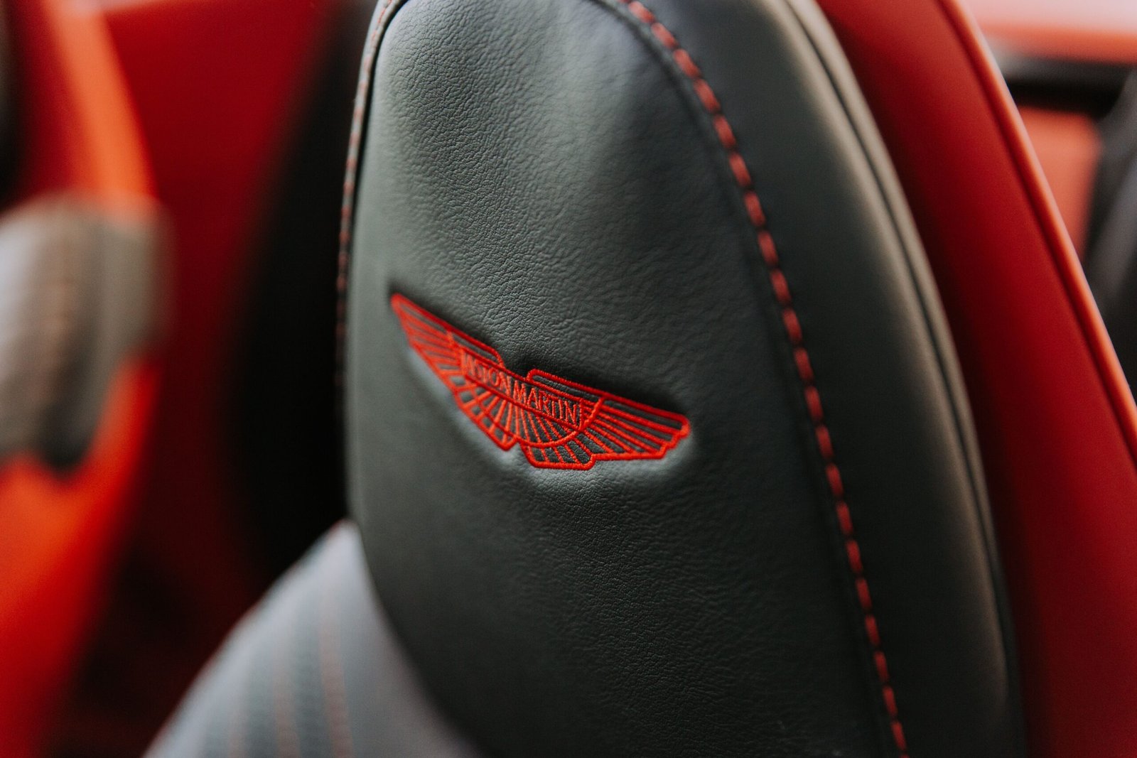
A logo is more than just a visual symbol representing a business. It is the face of a brand, the first impression customers develop, and an important element that communicates a company’s personality, values, and positioning. For premium businesses, a logo plays an even more significant role because it helps establish exclusivity, sophistication, elegance, and trust.
Think about some of the world’s most recognizable luxury brands. Their logos often feature carefully selected typography, balanced proportions, distinctive symbols, and minimal visual elements. They do not necessarily rely on complicated illustrations or bright colors to attract attention. Instead, they communicate quality through simplicity, consistency, and thoughtful design.
This is the foundation of successful Luxury Logo Design.
Whether you are creating a visual identity for a fashion house, jewelry company, beauty brand, premium restaurant, hotel, or high-end lifestyle business, your logo should communicate a sense of value before customers even experience the product or service.
However, designing a luxury logo requires more than choosing an elegant font and adding a gold color. Every detail matters, including spacing, proportions, typography, color psychology, visual hierarchy, and brand positioning.
A successful luxury logo should look sophisticated without appearing unnecessarily complicated. It should communicate exclusivity while remaining recognizable and memorable.
In this comprehensive guide, we will explore how to design a luxury logo from the beginning, choose appropriate fonts and colors, develop premium symbols, avoid common design mistakes, and create a timeless identity that supports long-term brand recognition.
1. Understand What Makes a Logo Look Luxurious
Before starting the design process, it is important to understand what makes a logo appear luxurious.
Luxury branding is generally associated with quality, craftsmanship, exclusivity, heritage, attention to detail, and exceptional customer experiences.
A premium logo should communicate these qualities through its visual appearance.
Unlike logos designed for mass-market businesses, luxury logos frequently prioritize refinement over visual complexity. They often use carefully selected typefaces, restrained color palettes, sophisticated compositions, and distinctive brand symbols.
Some important characteristics of luxury logos include:
-
Elegant and carefully balanced typography.
-
Minimalist visual compositions.
-
Sophisticated color combinations.
-
Consistent spacing and proportions.
-
Distinctive symbols or monograms.
-
Timeless design elements.
-
Strong visual recognition.
-
Adaptability across premium applications.
The most important principle is that luxury should feel intentional.
Adding gold gradients, decorative borders, crowns, or elaborate ornaments does not automatically make a logo luxurious. If these elements are not connected to the brand’s personality, they can make the design appear generic.
Instead, focus on creating a visual identity that communicates the actual value and positioning of the business.
2. Research the Brand Before Designing
Every successful luxury logo begins with research.
You should never start designing simply because you have an interesting visual idea. First, understand the business, its target audience, competitors, products, and overall positioning.
A luxury fashion brand requires a different visual identity from a premium skincare company or an exclusive hotel.
For example:
-
A luxury fashion label may need an elegant wordmark.
-
A premium jewelry brand may benefit from a refined monogram.
-
A luxury hotel may require a sophisticated emblem.
-
A premium skincare company may need a clean and understated identity.
-
An exclusive restaurant may benefit from elegant typography and a distinctive symbol.
Start by understanding the following brand elements.
Brand personality
Identify the personality the business wants to communicate.
Does the brand feel modern, traditional, elegant, bold, artistic, sophisticated, or exclusive?
A brand that emphasizes heritage may require traditional typography and an emblem-inspired logo. A modern luxury business may benefit from clean geometric lettering and minimal visual elements.
Target audience
Understand who will purchase the products or services.
Consider:
-
Age groups.
-
Purchasing behavior.
-
Lifestyle preferences.
-
Customer expectations.
-
Geographic markets.
-
Perception of premium products.
The logo should connect with the expectations of the intended audience.
Brand positioning
Determine whether the business is positioned as affordable premium, accessible luxury, high-end luxury, or ultra-exclusive.
This distinction affects typography, color choices, logo structure, and the overall visual direction.
Competitor analysis
Research other brands operating within the same industry.
Look at their typography, symbols, color combinations, and logo applications.
The purpose is not to copy competitors but to identify opportunities for differentiation.
A distinctive identity helps a premium brand establish its own visual personality.
3. Choose the Right Luxury Logo Style
One of the most important decisions in Luxury Logo Design is selecting the right logo structure.
Different logo styles communicate different qualities. Your choice should depend on the brand’s personality and practical requirements.
1. Wordmark logo
A wordmark uses the complete brand name as the primary visual element. It is particularly suitable for fashion labels, beauty brands, premium boutiques, and luxury lifestyle businesses.
2. Monogram logo
A monogram combines two or more initials into a distinctive symbol. It works especially well for jewelry brands, fashion houses, personal luxury labels, and premium accessories.
3. Emblem logo
An emblem combines typography and graphic elements within a unified shape. It can communicate tradition, heritage, craftsmanship, and exclusivity.
4. Abstract symbol logo
An abstract logo uses a unique shape or visual concept to represent a brand. It is useful for businesses that want a distinctive and modern identity.
5. Combination mark
A combination mark brings together typography and a symbol. It provides flexibility because the brand can use the complete logo or its symbol independently.
Before selecting a style, consider where the logo will appear. A website, product label, shopping bag, social media profile, and storefront may all require different logo arrangements.
4. Select Elegant Typography
Typography is one of the strongest visual elements in luxury branding.
A carefully selected typeface can communicate sophistication, exclusivity, tradition, modernity, and confidence without requiring additional graphic elements.
Many premium brands use serif typography because it can create an elegant and established appearance.
However, serif fonts are not the only option. Modern luxury brands also use carefully designed sans-serif typefaces.
Serif fonts
Serif typefaces feature small decorative strokes at the ends of certain letters.
They are commonly associated with:
-
Elegance.
-
Tradition.
-
Sophistication.
-
Heritage.
-
Editorial design.
-
Timeless aesthetics.
They can work particularly well for fashion, jewelry, premium hospitality, and beauty brands.
Sans-serif fonts
Sans-serif fonts have cleaner letterforms without decorative finishing strokes.
They can communicate:
-
Modernity.
-
Simplicity.
-
Confidence.
-
Precision.
-
Innovation.
-
Minimalism.
They are suitable for contemporary luxury businesses, technology brands, architecture studios, and modern lifestyle companies.
Display fonts
Display typefaces are designed to create visual impact.
They may contain distinctive letterforms, unusual proportions, or expressive details.
Use them carefully. A highly decorative typeface may look attractive at a large size but become difficult to read when reduced.
Important typography considerations
When choosing a luxury logo font, evaluate:
-
Letter proportions.
-
Stroke thickness.
-
Character spacing.
-
Readability.
-
Distinctive letterforms.
-
Visual balance.
-
Small-size performance.
-
Commercial licensing.
Never select a font simply because it looks expensive. It must support the brand’s identity and remain readable in real-world applications.
5. Use Negative Space to Create Sophistication
Negative space refers to the empty areas surrounding or within visual elements.
It is an important part of professional logo design because it helps create balance, clarity, and visual breathing room.
Luxury logos often benefit from generous spacing because it gives individual design elements room to stand out.
Consider a wordmark with tightly compressed letters. It may appear crowded and visually overwhelming.
Now imagine the same wordmark with carefully adjusted letter spacing. The design may immediately feel more refined.
Negative space can also become an intentional part of the symbol itself.
For example, a designer can create:
-
Hidden initials.
-
Subtle geometric shapes.
-
Abstract symbols.
-
Balanced visual relationships.
-
Interesting letter combinations.
However, negative space should have a purpose.
Adding excessive empty space without considering the composition can make the logo appear disconnected. The goal is to create visual balance rather than simply spreading elements apart.
6. Choose a Sophisticated Color Palette
Color psychology plays an important role in premium branding.
The colors used in a logo influence how people perceive a business. A luxury brand should select colors that complement its positioning, products, audience, and overall identity.
Some colors are frequently used in luxury branding because of their visual associations.
Black
Communicates sophistication, elegance, confidence, and exclusivity.
Hex: #171717
Gold
Often associated with prestige, craftsmanship, richness, and celebration.
Hex: #C5A15B
Ivory
Creates a softer, warmer, and more understated premium appearance.
Hex: #F5F0E7
Deep Green
Can communicate nature, heritage, refinement, and understated luxury.
Hex: #173D35
Navy Blue
Often associated with trust, professionalism, stability, and elegance.
Hex: #18263E
Burgundy
Can create a rich, expressive, sophisticated, and traditional appearance.
Hex: #713D48
Popular luxury color combinations
Some combinations worth exploring include:
-
Black and gold.
-
Ivory and charcoal.
-
Navy and silver.
-
Deep green and champagne.
-
Burgundy and cream.
-
Black and white.
-
Warm beige and dark brown.
Remember that color alone cannot create a premium identity. A poorly designed logo will not become luxurious simply because it uses gold.
A strong logo should work in a single color before you introduce additional color variations.
7. Create a Unique and Memorable Brand Symbol
A brand symbol helps customers recognize a business without necessarily reading its name.
For luxury brands, symbols often become valuable visual assets that appear on products, packaging, accessories, advertisements, and digital platforms.
A good symbol should be distinctive, meaningful, and visually simple.
Start by exploring the brand’s story.
For example, a jewelry company might use a subtle geometric interpretation of a gemstone. A fashion label might create a monogram from its initials. A premium skincare brand might develop an abstract symbol inspired by natural forms.
Some useful approaches include:
Initial-based symbols
Use the brand’s initials to create an identifiable monogram.
Experiment with overlapping letters, shared strokes, symmetrical arrangements, and custom typography.
Geometric symbols
Circles, lines, squares, and abstract forms can create a contemporary identity.
Geometric designs are especially useful for modern luxury businesses.
Nature-inspired symbols
Leaves, flowers, stars, and organic shapes can support brands associated with beauty, wellness, sustainability, and lifestyle.
Avoid using generic symbols without a clear connection to the brand.
Heritage-inspired symbols
Emblems, shields, and carefully constructed decorative elements can help communicate tradition and craftsmanship.
The symbol should feel connected to the business rather than added simply to fill empty space.
8. Keep the Logo Minimal and Timeless
Minimalism is one of the most effective approaches to premium logo design.
A minimal logo removes unnecessary elements while preserving the most important visual characteristics of the brand.
This does not mean every luxury logo must be extremely simple. Instead, it means every design element should serve a clear purpose.
A timeless luxury logo should avoid relying too heavily on temporary design trends.
Trends change quickly. A logo designed around a fashionable visual effect may become outdated within a few years.
To create a timeless design:
-
Avoid unnecessary decorative details.
-
Use a limited color palette.
-
Choose typography carefully.
-
Maintain balanced proportions.
-
Create recognizable visual elements.
-
Avoid complicated gradients and shadows.
-
Focus on long-term brand relevance.
A good test is to imagine the logo appearing on a premium product ten years from now.
Would it still look appropriate?
If the answer is yes, the design may have strong long-term potential.
9. Pay Attention to Spacing and Proportions
Professional logo design requires careful attention to proportions.
Even a simple wordmark can look unbalanced if the spacing between letters is inconsistent.
Similarly, a symbol may appear visually awkward if its height, width, and relationship with the brand name are not properly considered.
Important design elements include:
Kerning: Adjusting the spacing between individual letters to create a visually consistent wordmark.
Tracking: Adjusting the overall spacing across a group of letters.
Leading: Controlling the vertical distance between lines of text.
Alignment: Ensuring the symbol and typography are positioned correctly.
Proportions: Maintaining appropriate relationships between different logo elements.
For example, when creating a combination mark, the symbol should not overpower the brand name unless there is a deliberate reason.
Use alignment guides and geometric references to maintain consistency.
However, do not assume every professional logo must follow a mathematical grid perfectly. Optical adjustments are often necessary because different letterforms and shapes have different visual weights.
The final design should look balanced to the human eye.

10. Use Professional Logo Design Software
Choosing the right software can make the design process more efficient.
For luxury logo design, vector-based software is particularly valuable because it allows you to create scalable artwork without losing quality.
Here are some popular tools.
Adobe Illustrator
A professional vector design application suitable for creating custom typography, geometric symbols, monograms, and scalable logo artwork.
Best for: Advanced vector logo creation.
Figma
A collaborative design platform useful for developing logo concepts, exploring brand systems, and creating presentation mockups.
Best for: Collaborative branding workflows.
CorelDRAW
A vector illustration application that can be used for logo development, typography, and print-oriented branding projects.
Best for: Vector artwork and print design.
Canva
A beginner-friendly design platform that helps users experiment with typography, layouts, colors, and brand presentations.
Best for: Beginners and initial concepts.
Why vector design matters
A vector logo can be resized for different applications while preserving its quality.
For example, the same logo may need to appear on:
-
A small product label.
-
A business card.
-
A website header.
-
A large storefront sign.
-
A luxury shopping bag.
-
A promotional billboard.
Vector artwork makes these applications easier.
For professional delivery, consider providing SVG, EPS, PDF, and appropriate raster formats such as PNG and JPEG.
11. Develop a Strong Monogram for Premium Branding
Monograms are particularly popular in luxury branding because they can transform ordinary initials into distinctive visual identities.
A well-designed monogram can become recognizable even when the full brand name is not visible.
For example, imagine a premium fashion business called Aurelia Maison.
The designer could combine the letters A and M to create a sophisticated symbol.
The design process might involve:
-
Selecting the most suitable initials.
-
Exploring different letter combinations.
-
Experimenting with overlapping strokes.
-
Testing symmetrical and asymmetrical arrangements.
-
Adjusting letter proportions.
-
Simplifying unnecessary details.
-
Testing the monogram at different sizes.
A successful monogram should remain recognizable when printed on small accessories, embossed into leather, or displayed as a social media profile image.
Avoid combining letters in ways that make them impossible to identify.
The best monograms balance creativity with clarity.
12. Create a Premium Logo Through Custom Typography
One way to make a logo more distinctive is to customize its typography.
Using an existing font can be a useful starting point, but modifying selected letterforms can help create a more recognizable identity.
For example, you might:
-
Extend a particular letter stroke.
-
Modify the shape of the letter A.
-
Create a custom crossbar.
-
Adjust the terminal of a letter.
-
Change the proportions of selected characters.
-
Introduce a distinctive connection between letters.
Small modifications can make a wordmark feel more intentional and original.
However, customization should improve the design rather than reduce readability.
Always work from appropriately licensed fonts and check the licensing terms before using typefaces in commercial logos.
13. Design for Different Branding Applications
A luxury logo should not be designed only for a computer screen.
It must work across multiple physical and digital environments.
This is especially important because premium businesses often communicate their identity through carefully designed customer experiences.
Website and digital platforms
The logo should remain clear in website headers, navigation areas, digital advertisements, and social media profiles.
Product packaging
Premium packaging is one of the most important applications of luxury branding.
A logo may appear through:
-
Embossing.
-
Debossing.
-
Foil stamping.
-
Screen printing.
-
Engraving.
-
Raised lettering.
Business cards
Luxury business cards often use refined typography, quality paper, restrained colors, and generous spacing.
Storefront signage
The logo should remain recognizable from a distance and work with different materials and lighting conditions.
Clothing and accessories
Fashion brands may use their logos on labels, buttons, embroidery, tags, and metal hardware.
Social media
Create simplified versions of the logo for profile pictures, digital advertisements, and other small-format applications.
The objective is consistency.
Your logo should communicate the same brand personality regardless of where customers encounter it.
14. Understand the Importance of Material and Finishing Effects
Luxury branding is not limited to digital design.
The materials used to reproduce a logo can significantly influence how customers experience the brand.
A simple logo printed on high-quality material may appear more sophisticated than an elaborate design printed on an unsuitable surface.
Some premium finishing techniques include:
Gold foil stamping: Adds metallic detailing to packaging, invitations, and business cards.
Embossing: Creates a raised design that customers can physically feel.
Debossing: Produces an indented logo for an understated premium effect.
Spot UV: Adds selective gloss to particular areas of a printed surface.
Metal engraving: Can be used for jewelry, watches, accessories, and premium product components.
Letterpress printing: Creates a tactile impression that can communicate craftsmanship.
These effects should complement the logo rather than compensate for weak design.
Before approving a final logo, test how it performs in actual production conditions.
15. Avoid Common Luxury Logo Design Mistakes
Even experienced designers can make mistakes when creating premium brand identities.
Understanding these problems can help you improve the quality of your work.
Using too many decorative elements
Crowns, diamonds, wings, flourishes, borders, and ornamental symbols can quickly make a design look crowded.
Use only elements that have a meaningful connection to the brand.
Choosing overly complicated fonts
Highly decorative fonts may appear attractive initially but can become difficult to read.
Prioritize readability and distinctive letterforms.
Depending entirely on gold
Gold is commonly associated with luxury, but it is not essential.
Many premium brands build powerful identities using black, white, neutral shades, and other restrained colors.
Copying established luxury brands
Imitating the typography, symbols, or composition of famous brands can weaken originality and create potential legal problems.
Study established brands for inspiration, not replication.
Ignoring scalability
A logo that looks impressive on a large presentation screen may become unreadable on a small product label.
Test every important logo variation at different sizes.
Following every design trend
Trendy effects can quickly become outdated.
Prioritize a visual identity that supports the brand over the long term.
Ignoring trademark considerations
Before launching a logo commercially, conduct appropriate trademark searches.
Check whether similar marks already exist in relevant product and service categories.
Where necessary, seek professional intellectual property advice.
16. Build a Consistent Luxury Brand Identity Around the Logo
A luxury logo is only one part of a complete brand identity.
For a business to appear consistent and professional, its other visual elements should support the same design direction.
These elements include:
-
Brand typography.
-
Primary and secondary colors.
-
Packaging design.
-
Photography style.
-
Website layouts.
-
Marketing materials.
-
Social media graphics.
-
Product labels.
-
Brand messaging.
For example, a premium fashion brand with a minimalist black-and-white logo may use the same restrained approach throughout its website, packaging, product photography, and printed materials.
A luxury brand identity should feel consistent without becoming repetitive.
Create a brand guideline
A professional brand guideline helps maintain visual consistency.
It should include:
-
Primary logo.
-
Secondary logo.
-
Symbol or monogram.
-
Logo spacing rules.
-
Minimum size requirements.
-
Color specifications.
-
Typography guidelines.
-
Incorrect logo usage examples.
-
Background variations.
-
Practical application examples.
This document becomes especially useful when working with printers, marketing agencies, website designers, packaging manufacturers, and other creative professionals.
17. Test Your Luxury Logo Before Finalizing It
Never finalize a logo based only on how it looks in your design software.
Testing is necessary to identify visual problems and understand how the logo performs in real situations.
Use the following checklist.
Readability test: Can customers understand the brand name immediately?
Scalability test: Does the logo remain recognizable at small and large sizes?
Monochrome test: Does it work in black and white?
Contrast test: Is the logo visible against different backgrounds?
Print test: Does it reproduce accurately on physical materials?
Digital test: Does it look clear on mobile devices and websites?
Recognition test: Can people identify the logo after seeing it?
Uniqueness test: Does it look different from competitors?
Versatility test: Can the logo work across different applications?
Ask a small group of people from the intended target audience to review the design.
Do not rely entirely on personal preferences. Look for feedback about clarity, memorability, relevance, and perceived brand personality.
18. How to Design a Luxury Logo Step by Step
Now that we understand the essential principles, let’s combine them into a practical workflow.
Luxury logo design workflow
-
Research the brand
Understand its values, products, audience, personality, and market positioning.
-
Study the competition
Identify common design approaches and opportunities to create a distinctive identity.
-
Create a mood board
Collect references for typography, colors, shapes, materials, and overall visual direction.
-
Choose a logo style
Decide between a wordmark, monogram, emblem, symbol, or combination mark.
-
Explore typography
Test serif, sans-serif, and customized lettering options.
-
Develop initial concepts
Sketch multiple ideas before refining the strongest directions.
-
Refine proportions
Adjust spacing, alignment, letterforms, and visual balance.
-
Select the color palette
Test sophisticated color combinations while preserving monochrome functionality.
-
Create digital artwork
Convert the selected concept into clean vector artwork.
-
Test applications
Preview the logo on packaging, business cards, websites, signage, and products.
-
Finalize the brand assets
Prepare different logo variations and export the required file formats.
-
Prepare brand guidelines
Document the correct usage of the logo and related visual elements.
Following this process makes logo development more structured and reduces unnecessary revisions.
19. How to Present a Luxury Logo to a Client
If you are a freelance designer or branding agency, the way you present your work can influence how clients understand its value.
A professional presentation should explain the thinking behind the design rather than simply displaying a logo.
Start with the brand background and explain the visual direction.
Then present the logo concept with:
-
Primary logo artwork.
-
Secondary logo variations.
-
Monogram or symbol.
-
Typography selection.
-
Color palette.
-
Logo construction.
-
Black-and-white versions.
-
Packaging mockups.
-
Business card mockups.
-
Website applications.
Explain why each design decision supports the brand’s personality.
For example, if you choose a serif typeface, explain how its proportions and visual character support the brand’s traditional positioning.
If you create a minimal monogram, explain how it can work independently across products and accessories.
Use realistic mockups to demonstrate how the design works in everyday situations.
However, make sure the actual logo remains the focus. Too many decorative mockups can distract clients from evaluating the design itself.
20. Luxury Logo Design Trends to Watch
Although timelessness is important, designers should understand the changing visual directions within premium branding.
Here are some approaches worth exploring.
Minimalist wordmarks
Clean typography and restrained compositions continue to be useful for brands seeking a contemporary premium identity.
Custom lettering
More brands are exploring customized typography to create distinctive visual identities.
Refined monograms
Initial-based symbols provide a compact identity that can be applied to accessories, packaging, and digital platforms.
Heritage-inspired branding
Traditional emblems, classic typography, and historical references can help communicate craftsmanship and brand heritage.
Understated color palettes
Muted neutrals, deep greens, warm browns, charcoal, and restrained metallic tones can create sophisticated visual systems.
Flexible logo systems
Modern brands increasingly require different logo configurations for websites, mobile interfaces, packaging, and social media.
The most successful approach is to understand trends without becoming dependent on them.
A luxury logo should reflect the brand’s identity rather than simply follow what is currently fashionable.
21. How AI Is Changing Luxury Logo Design
Artificial intelligence is creating new possibilities for designers.
AI-powered design tools can help generate early concepts, explore visual directions, create mood boards, and experiment with different creative approaches.
However, AI-generated concepts should be treated as starting points rather than automatically approved final logos.
Luxury branding depends heavily on originality, precision, typography, and meaningful visual decisions.
A designer should carefully review AI-generated concepts for:
-
Originality.
-
Letterform accuracy.
-
Visual balance.
-
Brand relevance.
-
Scalability.
-
Trademark conflicts.
-
Technical quality.
AI tools may produce interesting ideas, but professional vector refinement and human creative judgment remain essential.
The strongest workflow combines technology with thoughtful design expertise.
22. How to Make a Luxury Logo More Memorable
Recognition is an important objective of every successful brand identity.
A logo may look beautiful but still fail if customers cannot remember or distinguish it.
To improve memorability, focus on a few important principles.
Develop a distinctive visual feature
Create one recognizable element, such as a custom letterform, monogram, or abstract symbol.
Avoid unnecessary complexity
A simple visual concept is generally easier to recognize than a crowded composition.
Maintain consistency
Use the same logo structure and visual identity across important customer touchpoints.
Create meaningful associations
Connect the logo with the brand’s products, values, craftsmanship, or heritage.
Test recognition
Show the logo to people and ask what they remember after viewing it.
The goal is not to make the logo complicated enough to attract attention. It is to make it distinctive enough to remain in people’s minds.
23. The Importance of Originality in Luxury Branding
Originality is essential when designing a premium identity.
Customers may encounter hundreds of logos across different industries. If your design looks almost identical to several existing brands, it becomes difficult to establish a unique identity.
Originality begins with understanding the brand’s story.
Think about what makes the business different.
Does it offer handcrafted products? Does it have a distinctive heritage? Does it focus on sustainable materials? Does it provide an exclusive customer experience?
These qualities can inspire a visual concept that feels authentic.
For example, a luxury jewelry business specializing in handcrafted gemstone pieces might develop an abstract symbol inspired by the geometry of its signature gemstone.
A boutique hotel with a long history might use an elegant emblem based on its architectural heritage.
The idea is to translate brand meaning into visual language.
Before commercial launch, conduct appropriate trademark and similarity checks. A visually original concept is not automatically legally available for use.
24. How to Create a Luxury Logo That Works for Global Audiences
Many premium brands serve customers across different countries and cultures.
This means logo designers should consider international usability.
A visual element that communicates sophistication in one market may have a different meaning elsewhere.
Consider the following factors:
-
Cultural interpretations of colors.
-
Readability of brand names.
-
Local language requirements.
-
Symbolic meanings.
-
International digital usage.
-
Print and production requirements.
For example, a brand operating internationally may need localized versions of its wordmark while preserving its primary symbol.
The logo should remain consistent enough to support global recognition while allowing appropriate adaptations.
Also, consider whether the brand name can be pronounced and recognized easily in its target markets.
25. Final Checklist for Professional Luxury Logo Design
Before delivering the final logo, review the entire design using this practical checklist.
Final design review
Reset checklist
Conclusion
Designing a luxury logo requires a combination of creativity, strategic thinking, and technical expertise. A premium visual identity should communicate sophistication, quality, exclusivity, and brand personality without relying on unnecessary decorative elements.
The most effective Luxury Logo Design process begins with understanding the business and its target audience. From there, designers can select appropriate typography, develop meaningful symbols, choose refined colors, establish balanced proportions, and create a flexible visual identity.
Remember that a luxury logo is not defined by how many expensive-looking effects it contains. Its real value comes from originality, thoughtful execution, consistency, and its ability to represent the brand over time.
Whether you are designing a logo for a luxury fashion label, premium jewelry company, exclusive hotel, or high-end beauty business, focus on creating something distinctive and timeless.
A well-designed logo can become one of the most valuable visual assets of a business. When supported by consistent branding, quality products, and exceptional customer experiences, it can help establish recognition and strengthen a brand’s premium positioning.
Ultimately, great luxury logo design is about creating an identity that communicates value through every detail.