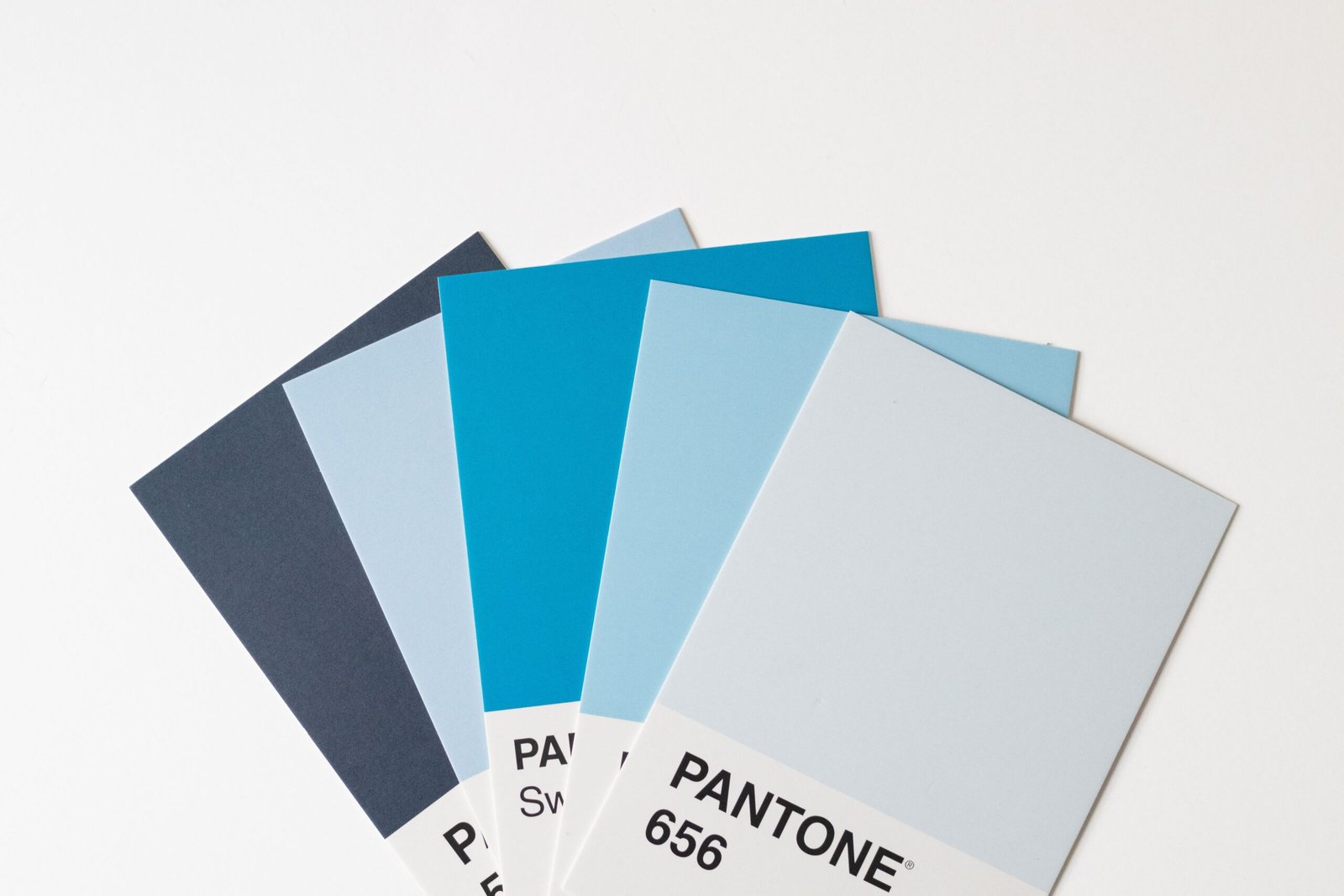
Choosing the right colors is one of the most important decisions when building a memorable brand identity. Colors influence how people perceive businesses, recognize products, and respond to visual messages. From a website and logo to packaging, social media graphics, and advertisements, brand colors help create a consistent identity that customers can recognize.
Think about some of the world’s most recognizable brands. Certain colors immediately bring particular companies to mind. Bright red may remind people of Coca-Cola, blue may evoke Facebook or Samsung, and green may bring Starbucks to mind. These associations develop through repeated exposure, consistent design, marketing, and customer experience.
This is why learning how to choose brand colors is essential for entrepreneurs, graphic designers, marketers, startups, and established businesses. The right palette can communicate your brand’s personality, support your positioning, distinguish your business from competitors, and make your visual identity more cohesive.
However, selecting brand colors is not simply about choosing your favorite shade or following a design trend. Effective brand colors should reflect your business values, appeal to your intended audience, work across different platforms, and remain recognizable over time.
A color palette that looks attractive on a designer’s screen may not work equally well on printed packaging, mobile displays, signage, or promotional materials. Similarly, a fashionable color combination might look impressive today but become outdated if it is chosen without considering the brand’s long-term goals.
In this comprehensive guide, you will learn how to choose brand colors strategically, understand color psychology, research your audience, analyze competitors, create a balanced color palette, and apply your colors consistently across every customer touchpoint.
Whether you are launching a new business or refreshing an existing identity, these principles will help you make informed branding decisions.
1. Understand What Brand Colors Are
Brand colors are the specific colors a business uses consistently to represent its identity across visual communications.
They form an important part of a brand’s visual identity, alongside its logo, typography, photography style, illustrations, graphic elements, and overall design language.
A well-developed brand color palette usually includes several coordinated colors rather than a single shade.
For example, a business might use a deep navy blue as its primary color, a pale blue as a secondary color, white as a neutral background, and a bright orange as an accent.
Each color serves a different purpose, but together they create a recognizable visual system.
Why are brand colors important?
Brand colors contribute to several important business goals.
-
Brand recognition: Repeated use of consistent colors helps people identify your business across different platforms.
-
Brand personality: Colors can support perceptions such as energetic, sophisticated, friendly, trustworthy, or innovative.
-
Visual consistency: A defined palette helps designers create coordinated websites, advertisements, packaging, and social media content.
-
Differentiation: Strategic color choices can help your business stand apart from competitors.
-
Communication: Color can draw attention to important information, separate content sections, and guide users through a design.
-
Emotional associations: Colors may influence how customers interpret a brand, although these responses vary with context, culture, and personal experience.
Brand colors do not create trust or sales on their own. Product quality, customer service, pricing, reputation, and the overall customer experience matter as well.
The goal is to use color as one part of a coherent brand strategy rather than treating it as an isolated decoration.
2. Define Your Brand Personality Before Choosing Colors
One of the biggest mistakes businesses make is selecting colors before deciding what their brand should communicate.
A strong color palette starts with a clear understanding of the business itself.
Ask yourself: If customers could describe your brand using three words, what would those words be?
Your answer provides a useful starting point for choosing appropriate colors.
also read: How to Create a Brand Identity: A Complete Step-by-Step Guide
Identify your brand’s core characteristics
Consider the following brand personalities.

Luxury and sophistication
Luxury brands may use black, ivory, deep brown, muted metallic tones, or carefully controlled jewel colors. Restrained palettes and generous negative space can reinforce a premium appearance.

Natural and sustainable
Forest green, sage, warm beige, earthy brown, and muted neutrals may support a brand focused on nature, sustainability, organic products, or botanical ingredients.

Innovative and modern
Blue, violet, cool neutrals, and selective bright accents can support a contemporary technology brand. Clean layouts and consistent typography help complete the impression.

Playful and energetic
Coral, yellow, turquoise, and other lively colors may work well for entertainment, children’s products, creative services, or youthful lifestyle brands.
These examples are starting points, not fixed rules. A luxury brand can use bright colors, and a technology company can use warm earth tones. The important question is whether the palette supports the brand’s intended personality.
Create a list of brand adjectives
Before opening a color-selection tool, write down three to five adjectives that describe your business.
For example:
-
Professional
-
Dependable
-
Modern
-
Approachable
-
Innovative
Then consider which color combinations could visually support these characteristics.
A financial services company might explore navy, blue-gray, and white to communicate stability. A creative studio might choose a more distinctive combination of plum, coral, and cream.
The best way to choose brand colors is to start with meaning, not personal preference.
3. Learn the Basics of Color Psychology
Color psychology explores how colors relate to human perception, emotion, and behavior. In branding, designers use these associations to develop a visual identity that supports the brand’s intended message.
However, color psychology is not a universal formula. A particular shade does not produce the same reaction in every person. Meaning can change according to culture, context, industry, saturation, brightness, and previous experiences.
Understanding common associations can still help you generate and evaluate color ideas.
Red: Energy, urgency, and passion
Red is visually prominent and can communicate excitement, intensity, warmth, or urgency.
It may suit food brands, entertainment businesses, sports companies, and campaigns that need strong visual impact.
Red can also feel aggressive or overwhelming when used excessively. Consider using it selectively if your brand needs a calm or understated personality.
Blue: Trust, stability, and professionalism
Blue is frequently used by technology companies, financial institutions, healthcare organizations, and professional service providers.
Depending on its shade, blue can appear conservative, approachable, futuristic, or sophisticated.
Dark navy often feels formal, while bright blue may feel more energetic and contemporary. Pale blue can create a softer, more open visual impression.
Green: Nature, growth, and balance
Green is commonly associated with vegetation, renewal, sustainability, and health.
It may be suitable for gardening businesses, wellness brands, environmentally focused companies, food products, and organizations that emphasize natural ingredients.
However, green is not automatically the right choice for every sustainable business. Your positioning, audience, and competitive environment should guide the decision.
Yellow: Optimism, warmth, and attention
Yellow can create a bright, cheerful, and energetic appearance. It may work well for lifestyle brands, children’s products, creative businesses, and brands seeking a friendly personality.
Bright yellow can be difficult to read when used for small text or against white backgrounds. Darker text and carefully selected background colors help maintain readability.
Orange: Creativity, friendliness, and enthusiasm
Orange often combines the energy associated with red and the brightness associated with yellow.
It can support brands that want to appear accessible, dynamic, youthful, or creative.
Depending on the shade, orange can also feel earthy, sporty, or premium. Burnt orange and terracotta, for example, have a very different appearance from neon orange.
Purple: Creativity, individuality, and luxury
Purple can suggest imagination, sophistication, mystery, or individuality.
It may suit beauty brands, creative agencies, entertainment products, premium services, and businesses seeking a distinctive identity.
Deep plum often appears richer and more formal than bright violet, which can feel more contemporary or expressive.
Black: Authority, elegance, and simplicity
Black is widely used in premium branding, fashion, technology, photography, and editorial design.
It can provide strong contrast and make other colors stand out. Yet excessive black may appear severe or heavy if the brand is intended to feel playful or welcoming.
White: Simplicity, openness, and clarity
White often supports clean, minimal, and modern visual identities.
It is useful as a background color, particularly when a brand needs to emphasize photography, product details, or typography.
White is not always the most practical primary color for every application, but it is often a valuable part of a flexible palette.
Brown: Warmth, reliability, and craftsmanship
Brown and related earthy tones can suggest natural materials, heritage, comfort, and authenticity.
They may work well for coffee brands, handmade products, artisan businesses, outdoor companies, and traditional food brands.
Pink: Warmth, expression, and playfulness
Pink can communicate softness, romance, creativity, boldness, or modern self-expression depending on its shade and context.
It should not be restricted to a single audience or industry. Strong magenta, muted rose, and pale blush can support very different brand personalities.
How to use color psychology correctly
Use color associations to generate possibilities, not to make assumptions about every customer.
Instead of asking, “Which color always represents trust?” ask, “Which palette will help our target audience perceive this particular business as trustworthy, relevant, and distinctive?”
That question leads to better branding decisions.
4. Research Your Target Audience
Your brand colors should be appropriate for the people you want to reach.
Different audiences may respond differently to the same visual identity. Factors such as age, cultural background, interests, purchasing habits, and familiarity with a category can influence how a palette is interpreted.
For this reason, audience research is an essential step in learning how to choose brand colors effectively.
Identify your ideal customer
Start by answering these questions:
-
Who is most likely to buy your product or service?
-
What problems are they trying to solve?
-
What values influence their purchasing decisions?
-
Which brands do they already trust?
-
Do they prefer traditional, modern, playful, or premium experiences?
-
Where will they encounter your brand?
For example, a business selling premium skincare products may target consumers who value quality, ingredients, and a refined experience. A brand selling affordable sports accessories may need to communicate energy, accessibility, and practicality.
Both businesses need effective color palettes, but their visual priorities may differ.
Conduct simple audience research
You do not need an expensive research project to begin gathering useful information.
You can:
-
Interview a small selection of existing or potential customers.
-
Ask customers which of several visual directions feels most appropriate.
-
Review feedback on your current branding.
-
Examine customer reviews to understand the qualities people value.
-
Compare how different palettes appear in realistic product or website mockups.
Avoid asking only which color people like best. A more useful question is which design best communicates your intended brand personality and why.
Consider cultural differences
Color meanings vary across cultures and contexts. A color that communicates celebration in one setting may be associated with mourning or formality in another.
If your business serves multiple countries or cultural groups, test your palette in the markets that matter to you.
Audience research makes your decisions more relevant and reduces reliance on assumptions.
5. Analyze Competitors Before Selecting Your Palette
A good brand identity should fit its industry while remaining recognizable among competing businesses.
Studying competitors can reveal common color patterns, market expectations, and opportunities to differentiate your company.
Create a competitor color map
Select five to ten direct competitors and examine their visual identities.
Record:
-
Their primary colors.
-
Their secondary and accent colors.
-
Their logo styles.
-
Their website backgrounds.
-
Their packaging and advertising designs.
-
The personality their visual identity appears to communicate.
Look for patterns. For example, if most businesses in a particular industry use navy blue and gray, those colors may reflect established category expectations.
You can decide whether to use a familiar visual direction or introduce a different palette.
Should your brand use the same colors as competitors?
Not necessarily.
Using colors associated with your industry may help customers understand what kind of business you are. However, copying a competitor’s distinctive palette can make your company less recognizable and may create confusion.
Suppose several competitors use dark blue and green. Your brand might explore teal, warm ivory, and a restrained coral accent while still maintaining a professional appearance.
The objective is not to be different at any cost. It is to create a meaningful distinction that supports your positioning.
Evaluate differentiation in context
A palette that looks unique in isolation might become less distinctive when applied to a logo, website, or product shelf.
Place your proposed design next to competitor examples. Evaluate whether it stands out for the right reasons and whether customers can still understand your brand category.
This comparison is one of the most practical ways to choose brand colors strategically.
6. Choose a Primary Brand Color
Your primary brand color is usually the most recognizable color in your visual identity.
It may appear in your logo, website header, social media templates, packaging, presentation materials, and other prominent brand elements.
However, the primary color does not need to dominate every design. It should serve as the anchor for a coordinated palette.
How to select the right primary color
Start with three criteria.
1. Brand alignment: Does the color support the personality and positioning you have defined?
2. Audience relevance: Is it appropriate for the people you want to reach?
3. Market differentiation: Does it help distinguish your brand from competitors?
A primary color should satisfy these criteria reasonably well rather than winning on just one dimension.
Consider the exact shade
Choosing a general color family is only the first step. The exact shade can dramatically change the overall appearance.
For example:
-
Navy blue can look formal and established.
-
Bright blue can feel energetic and digital.
-
Dusty blue can appear understated and calm.
-
Electric blue can feel bold and futuristic.
The same principle applies to green, red, purple, and other color families.
Test your primary color in real applications
Do not select a primary color solely from a palette displayed on a white screen.
Test it on:
-
Your logo.
-
Website navigation.
-
Social media graphics.
-
Product packaging.
-
Business cards.
-
Advertising materials.
-
Dark and light backgrounds.
A color that works well in one context may need supporting shades or contrast adjustments elsewhere.
Your primary brand color should be distinctive, versatile, and practical.
7. Build a Balanced Brand Color Palette
After selecting a primary color, choose supporting colors that create a coherent visual system.
A strong brand palette often contains three to five core colors, although some identities need fewer and others require more extensive systems.
The key is to assign each color a purpose.
The primary color
This is the main color associated with your brand. It helps establish recognition and often appears in prominent brand elements.
Secondary colors
Secondary colors complement the primary color and expand your design options.
They may be used in illustrations, supporting sections, backgrounds, graphics, and campaign materials.
Accent colors
Accent colors create emphasis. They may highlight important buttons, promotional messages, selected icons, or specific details.
An accent color should be used deliberately so it remains visually effective.
Neutral colors
Neutrals include white, off-white, gray, beige, charcoal, and black.
They help create space, improve readability, and balance stronger colors.
Many brands rely heavily on neutral backgrounds because they make product photography, text, and key visual elements easier to understand.
Example of a coordinated palette
Modern Wellness Brand
An illustrative palette for a calm, contemporary wellness business.
Forest Green
#245B4A
Primary color
Sage Green
#A8C3A0
Secondary color
Warm Ochre
#D9A66B
Accent color
Warm Ivory
#F6F2E9
Neutral background
These HEX values are illustrative starting points, not a universally validated or accessibility-tested palette.
This example uses forest green to anchor the identity, sage green for supporting elements, ochre for selected highlights, and ivory for open, uncluttered backgrounds.
The colors work as a system because they have different visual roles.
Avoid adding too many colors
A palette with ten unrelated colors can make a brand feel inconsistent, especially when multiple designers create content.
Start with a limited core palette. Add more colors only when you have a clear reason, such as data visualization, product categories, or accessibility requirements.
A simple system is often easier to maintain and more recognizable.
8. Understand Color Theory and Color Combinations
Color theory helps designers understand how colors relate to one another. It provides useful starting points for building palettes that feel coordinated.
You do not need to master advanced color theory to develop an effective brand identity, but a few basic concepts can improve your decisions.
Monochromatic color schemes
A monochromatic palette uses variations of one color, typically created by changing its lightness and sometimes its saturation.
For example, a blue brand might use navy, medium blue, pale blue, and blue-gray.
This approach can produce a cohesive and restrained identity.
It is especially useful for professional services, technology businesses, editorial design, and brands that want a consistent visual language.
Analogous color schemes
Analogous colors sit next to each other on the color wheel.
Examples include blue, blue-green, and green, or red, red-orange, and orange.
These combinations can feel harmonious because the colors share related characteristics.
However, designers still need to establish enough contrast between text, backgrounds, and interactive elements.
Complementary color schemes
Complementary colors sit opposite each other on the traditional color wheel.
Examples include blue and orange or red and green.
These combinations can create strong contrast and visual energy. They are useful when a brand wants to distinguish primary elements from supporting elements.
However, highly saturated complementary colors can compete for attention. Using one color as the dominant shade and the other as an accent often creates a more balanced result.
Triadic color schemes
A triadic scheme uses three colors spaced approximately evenly around the color wheel.
These palettes can create energetic and versatile identities, particularly for creative, entertainment, educational, or lifestyle brands.
They require careful control of proportions. If all three colors are equally bright and equally prominent, the design may feel chaotic.
How to choose the right color combination
Start by selecting a primary color that supports your brand personality. Then experiment with complementary, analogous, or monochromatic supporting colors.
Review the combinations at realistic sizes and in different contexts.
A palette should work as a practical design system, not merely as a collection of attractive swatches.
9. Use the 60-30-10 Rule as a Starting Point
The 60-30-10 rule is a design guideline that suggests distributing three colors across a composition in approximate proportions.
-
60% dominant color: Often a neutral or background color.
-
30% secondary color: Adds visual structure and brand character.
-
10% accent color: Draws attention to selected details.
For example, a website might use a light neutral background for most of its surface, a primary brand color for navigation and section headings, and an accent color for important buttons.
These percentages are not strict requirements for every brand.
A minimalist logo may use only one or two colors. A bold packaging design might use a strong primary color across most of its surface. A photography-led website may rely primarily on neutral backgrounds.
The principle is more important than the exact percentages: give colors distinct roles and avoid allowing every color to compete for attention.
10. Choose Brand Colors for Your Industry
Your industry can provide useful context when deciding how your business should look.
Although you should not follow category conventions blindly, familiar visual cues can help customers understand your offering.
Technology and software
Technology brands often explore blue, violet, black, white, and cool neutrals.
These colors can support a modern or professional appearance, although more distinctive palettes can also work.
Prioritize clarity, usability, and accessible interface design if your brand includes a digital product.
Health and wellness
Wellness businesses may use green, blue, lavender, warm neutrals, and other colors associated with calmness or nature.
The best choice depends on the brand’s specific positioning. A sports performance business may require a very different visual identity from a premium meditation studio.
Food and beverage
Food brands may use red, orange, yellow, green, brown, or contrasting neutrals.
The appropriate palette depends on the product, target customer, packaging format, and competitive context.
Color can also help distinguish flavors, product ranges, or levels of intensity.
Fashion and beauty
Fashion and beauty brands use a wide variety of palettes, from black and ivory to bright pink, metallic-inspired shades, earthy colors, and vivid combinations.
Premium positioning often depends as much on typography, material choices, photography, and layout as on color itself.
Finance and professional services
Navy, blue, gray, green, and restrained neutral palettes are common options for professional services.
However, a business may differentiate itself through warmer colors or a more contemporary palette if that direction supports its values and audience.
Education and children’s products
Education and children’s brands may use bright, varied colors to communicate energy, curiosity, and accessibility.
The challenge is to maintain a clear visual hierarchy rather than overwhelming the viewer with too many equally prominent colors.
The right brand colors are the colors that support your positioning and audience—not simply the colors most commonly used in your industry.
11. Consider Accessibility and Color Contrast
Accessibility is a critical part of choosing brand colors, especially for websites, mobile applications, digital documents, and marketing materials.
A visually attractive palette can still create problems if text is difficult to read or important information depends entirely on color.
For example, pale yellow text on a white background may look subtle but can be almost impossible for some users to read.
Understand contrast ratios
The Web Content Accessibility Guidelines (WCAG) provide measurable contrast requirements for digital content.
For WCAG 2.2 Level AA, the general minimum contrast ratio is:
-
4.5:1 for normal-sized text.
-
3:1 for large text.
Large text generally means at least 18-point regular text or 14-point bold text, subject to the WCAG definitions.
These requirements are important when choosing text colors, button labels, navigation elements, and other digital content.
Test your palette
Use a contrast checker to evaluate combinations such as:
-
Brand color with white text.
-
Brand color with black text.
-
Accent color with a neutral background.
-
Button background with its label.
-
Text over colored images or gradients.
Do not assume that two colors provide adequate contrast simply because they look different.
Do not communicate meaning through color alone
For example, an error message should not be indicated only by a red border. Add explanatory text or another visual cue.
Similarly, charts should use labels, patterns, or other distinguishing features where necessary.
Accessible color decisions make your brand easier to use for more people and improve the practical quality of your visual identity.
12. Choose Brand Colors for Websites and Digital Platforms
A brand’s colors need to work across more than its logo.
Your website, app, email templates, social media graphics, and online advertisements should follow a consistent visual system.
Digital environments also introduce practical challenges such as different display settings, screen brightness, and background colors.
Define digital color roles
Instead of simply listing HEX values, create a set of functional color tokens.
For example:
-
Primary brand color.
-
Primary hover color.
-
Secondary background.
-
Main text color.
-
Muted text color.
-
Border color.
-
Success color.
-
Warning color.
-
Error color.
-
Link color.
These roles make it easier for designers and developers to apply colors consistently.
Design a consistent website
Use your primary color for prominent brand elements and your secondary colors to organize the layout.
Reserve accent colors for selected actions or highlights rather than applying them to every heading, icon, and button.
Maintain sufficient contrast between text and its background. Test the website on different screen sizes and under different viewing conditions.
Create social media consistency
Social media content often changes from one post to the next, but a recognizable color system helps maintain continuity.
Create reusable templates for announcements, educational content, promotions, testimonials, and product highlights.
Use the same core colors, typography, and graphic elements to create a recognizable appearance across platforms.
Consistency does not mean every post must look identical. It means each post should still feel as if it belongs to the same brand.
13. Choose Brand Colors for Packaging and Print
Print introduces additional considerations because colors do not always reproduce identically across screens and physical materials.
A shade that looks bright on a monitor may appear duller or different when printed on paper, cardboard, fabric, or plastic.
Understand RGB and CMYK
RGB is an additive color model used by digital displays. It combines red, green, and blue light.
CMYK is a subtractive color model commonly used in commercial printing. It uses cyan, magenta, yellow, and black inks.
Because the models work differently, not every RGB color can be reproduced exactly in CMYK.
For this reason, a digital brand palette should be checked before being used for print production.
Test colors on the intended material
Packaging material, coatings, lighting, and printing processes can affect the final appearance.
Before approving a large production run:
-
Request a proof or sample.
-
Check the colors on the actual or representative material.
-
Review small text and important contrast areas.
-
Confirm that logos remain clear at the intended size.
-
Approve the final production specifications.
For certain high-consistency applications, a spot-color system may be appropriate.
Maintain brand consistency across materials
Your business cards, brochures, labels, signs, and packaging should appear coordinated even when different production methods are involved.
Exact visual matching may not always be possible, but documented color specifications and production checks help reduce unwanted variation.
14. Use HEX, RGB, CMYK, and Other Color Codes Correctly
Professional brand guidelines should specify the colors clearly enough for different people to reproduce them.
A color name such as “dark blue” is not precise enough for consistent design work.
HEX codes
HEX codes are commonly used in websites and digital design tools.
For example, #245B4A represents a particular dark green in the standard six-digit HEX format.
RGB values
RGB describes a color through red, green, and blue channel values. It is commonly used for screens and digital graphics.
CMYK values
CMYK values specify the proportions of cyan, magenta, yellow, and black used in a print color.
Conversions from RGB or HEX to CMYK can vary depending on the printing conditions and color profile, so the values should be prepared appropriately for the production process.
Pantone and spot colors
Pantone is a color-matching system used in many design and print workflows. A spot-color specification may help maintain consistency in certain print applications.
It is not necessary for every small business, but it can be useful when exact color reproduction is particularly important.
Create a brand color specification sheet
Your brand guidelines should record:
-
Color name.
-
HEX code.
-
RGB values.
-
CMYK values where appropriate.
-
Spot-color reference if required.
-
Approved text and background combinations.
-
Guidance about where the color should be used.
This document makes it easier for employees, designers, developers, and print suppliers to apply your palette correctly.
15. Test Your Brand Colors Before Making a Final Decision
Choosing colors is not a one-time exercise based entirely on intuition.
Before finalizing your palette, test how it performs in realistic applications.
A color may look impressive in a presentation but fail when used in a small logo, a crowded social media graphic, or a website button.
Create several palette variations
Develop two or three distinct options rather than producing dozens of nearly identical combinations.
For each option, prepare:
-
A logo concept.
-
A website homepage mockup.
-
A social media post.
-
A business card.
-
A packaging or product mockup, where relevant.
Compare the concepts side by side.
Evaluate each option against clear criteria
Ask:
-
Does the palette communicate the intended brand personality?
-
Is it appropriate for the target audience?
-
Does it stand apart from competitors?
-
Is it readable and accessible?
-
Does it work on digital and print materials?
-
Can the palette support future business growth?
-
Is it easy to use consistently?
You can score each palette against these criteria to make the decision more systematic.
Gather useful feedback
Ask a small group of potential customers or stakeholders to review the designs.
Avoid relying exclusively on comments such as “I like the blue one.” Ask which option feels more professional, distinctive, friendly, premium, or relevant to the product.
The purpose of testing is to identify whether the design communicates the right message, not simply whether people find it attractive.
16. Use Brand Color Tools to Simplify the Process
Color tools can help you generate combinations, inspect contrast, and organize your palette.
They are useful starting points, but the results still need to be evaluated in the context of your business.

Adobe Color
Useful for exploring color harmonies, building palettes, and experimenting with relationships between colors.
Website: color.adobe.com

Coolors
Helpful for generating palette ideas, exploring color combinations, and saving possible brand color schemes.
Website: coolors.co

WebAIM Contrast Checker
Useful for checking text and background contrast against common WCAG requirements.
Website: webaim.org/resources/contrastchecker
How to use these tools effectively
Begin with your brand personality and target audience. Generate several possible palettes, apply them to realistic mockups, and then test readability and contrast.
Do not choose a palette just because a generator labels it harmonious. A technically harmonious palette may still be unsuitable for your industry, audience, or brand positioning.
Tools support the creative process; they do not replace strategic judgment.
17. Common Mistakes to Avoid When Choosing Brand Colors
Even an attractive palette can become ineffective if it is applied without a clear strategy.
Mistake 1: Choosing colors based only on personal preference
Your favorite color may not support the personality or positioning of your business.
Solution: Use brand values, audience research, and competitive analysis to guide your selection.
Mistake 2: Following trends without considering longevity
Trending colors can make a brand look contemporary, but relying entirely on short-lived trends may lead to frequent redesigns.
Solution: Build the core identity around enduring brand principles. Use trends selectively in campaigns or supporting graphics.
Mistake 3: Using too many colors
An excessive number of colors can make websites, logos, and promotional materials feel inconsistent.
Solution: Establish a small core palette and assign each color a defined role.
Mistake 4: Ignoring accessibility
A palette can look beautiful and still create serious readability problems.
Solution: Test contrast ratios, use readable typography, and avoid relying on color alone to communicate information.
Mistake 5: Copying competitors
Imitating another company’s palette can weaken your differentiation and make your business harder to recognize.
Solution: Study competitors to understand the market, then identify a palette that reflects your own positioning.
Mistake 6: Failing to test print reproduction
Colors can change when transferred from digital displays to printed materials.
Solution: Check color profiles and approve physical proofs before committing to production.
Mistake 7: Changing brand colors too frequently
Constantly changing your palette can weaken consistency across customer touchpoints.
Solution: Maintain documented guidelines and make substantial changes only when there is a strategic reason.
Mistake 8: Ignoring the rest of the visual identity
Color cannot compensate for inconsistent typography, confusing layouts, poor photography, or an unclear brand message.
Solution: Develop your palette as part of a complete brand identity system.
18. Create Brand Color Guidelines for Your Business
Once you have chosen your brand colors, document how they should be used.
Brand guidelines help maintain consistency when multiple people create content or when your business expands into new channels.
What should your guidelines include?
Primary palette: The core colors associated with your brand.
Secondary palette: Supporting colors for layouts, illustrations, and campaigns.
Color codes: HEX, RGB, CMYK, and relevant spot-color specifications.
Usage proportions: Guidance about which colors should dominate and which should be used sparingly.
Contrast rules: Approved foreground and background combinations for readable text and interface elements.
Logo applications: Approved logo colors and suitable light and dark backgrounds.
Digital applications: Rules for buttons, links, headers, website backgrounds, and social media templates.
Print applications: Guidance for packaging, brochures, stationery, and other physical materials.
Examples of incorrect usage: Show what happens when colors are altered, mixed inconsistently, or applied to unsuitable backgrounds.
Make the guidelines easy to follow
A brand guide should be practical rather than unnecessarily complicated.
Use visual examples to demonstrate correct applications. Make the document accessible to anyone who may need to use your brand assets, including external designers and production partners.
Clear guidelines reduce mistakes and make the identity easier to maintain as your business grows.
19. A Step-by-Step Brand Color Selection Workflow
If you are starting from scratch, use the following process to turn the principles in this guide into a practical project.
Step 1: Define your brand
Identify your purpose, values, personality, audience, and intended market position.
Step 2: Research the market
Examine competitor palettes and identify visual patterns, expectations, and opportunities for differentiation.
Step 3: Develop palette concepts
Choose a primary color and experiment with supporting colors, neutrals, and accents.
Step 4: Test realistic applications
Apply the palettes to a logo, website, packaging, and social media templates.
Step 5: Evaluate and refine
Review brand alignment, customer feedback, differentiation, usability, and accessibility.
Step 6: Document your final palette
Record the exact color codes, usage rules, approved combinations, and production requirements.
Following this workflow helps you make informed decisions rather than choosing colors randomly.
Frequently Asked Questions About How to Choose Brand Colors
1. How do I choose the best colors for my brand?
Start by defining your brand personality, target audience, business values, and competitive position. Choose a primary color that supports these factors, then add complementary secondary colors, accents, and neutrals. Test the complete palette in real applications before finalizing it.
2. How many colors should a brand have?
Many brands can work effectively with three to five core colors. A typical palette includes a primary color, one or two supporting colors, an accent, and one or more neutrals. The ideal number depends on your design requirements and the complexity of your business.
3. What is the 60-30-10 rule in branding?
The 60-30-10 rule is a design guideline that allocates approximately 60% of a composition to a dominant color, 30% to a secondary color, and 10% to an accent. It can help balance a website or marketing design, but it is not a mandatory formula for every brand.
4. Which color is best for a professional brand?
Blue, navy, gray, black, and neutral tones are common starting points for professional brands. However, no single color guarantees professionalism. Typography, layout, photography, messaging, and consistency all contribute to how a business is perceived.
5. Should my logo and website use the same brand colors?
Generally, yes. Your logo and website should share a consistent core palette. However, not every logo color needs to appear equally often on the website. Use primary, secondary, accent, and neutral colors according to their assigned roles.
6. Can I change my brand colors later?
Yes. A business may update its colors when its audience, positioning, products, or visual identity evolves. A change should have a clear strategic reason and should be implemented consistently across relevant brand materials.
7. How can I make my brand colors look premium?
Consider a restrained palette, carefully selected shades, strong contrast, refined typography, and consistent spacing. Black, ivory, navy, deep green, and muted metallic-inspired tones can be useful starting points, but premium perception depends on the complete design and customer experience.
8. Are brand colors important for SEO?
Brand colors do not directly determine search rankings. However, an effective visual identity can support recognition, improve the usability of websites, and help create a consistent user experience. Accessibility, readable text, useful content, page performance, and technical SEO remain important considerations.
9. Which tools can help me choose brand colors?
Adobe Color and Coolors can help generate and explore palettes. WebAIM Contrast Checker can help assess text and background contrast. You can then test the colors in design software and realistic mockups before approving them.
10. Should small businesses invest in professional color selection?
Small businesses can begin with accessible color tools and a clearly defined brand strategy. Professional design assistance may be worthwhile when the identity needs to stand out in a competitive market, support extensive packaging or digital applications, or meet demanding production requirements.
Conclusion: Choose Brand Colors That Build a Lasting Identity
Learning how to choose brand colors is an important step toward building a strong, recognizable, and consistent brand identity.
The right palette does more than make your business look attractive. It supports your positioning, communicates your personality, distinguishes your business from competitors, and creates continuity across websites, logos, packaging, social media, and marketing materials.
Start by understanding your brand values and target audience. Research competitors, explore color psychology, choose a primary color, and build a balanced palette with supporting shades and neutrals.
Then test your choices in real applications. Check accessibility, evaluate digital and print performance, collect useful feedback, and document the final specifications in clear brand guidelines.
Remember that successful branding is not about finding the most fashionable color or following a universal color formula. It is about choosing colors that work together to communicate the right message to the right audience.
The best brand colors are distinctive, purposeful, accessible, and consistent. By selecting them strategically and applying them thoughtfully, you can create a visual identity that remains recognizable as your business grows.